Thursday 2 May 2013

End of Term 2 - Summary

This term was harder than last term, even though we had less projects to do but 2 of them were long. And also because of the situation I was in, with my husband being in and out of the hospital for the past 3 months. 

I liked designing all projects except for the map and the drinking awareness postcards (just the topic didn't interest me, otherwise I like designing postcards). I really enjoyed designing the iPad app interface, even though it was during hard times and I was under alot of pressure. I used the iPad interface for my App Development class, but I changed a few things, like colors and layout. 
Overall, I enjoyed this year's Graphic Design class, because we got more projects to design and I felt I learned more. 

Tuesday 30 April 2013

iPad Interface Design - Dalia's Florist

The following is the iPad app interface I designed for a florist, Dalia's Florist. All illustrations (app icon and menu icons, logo, buttons and pages) were designed using Illustrator and put together in Photoshop. I used feminine colors because they're similar to the colors that my cousin (the florist) chose for her business card.

I added the screen shots for the app I designed and created in App Development class which is this app, Dalia's Florist. It's a little bit different from what I designed here.

iPad App icon

App start-up page when the App loads
 
Menu page

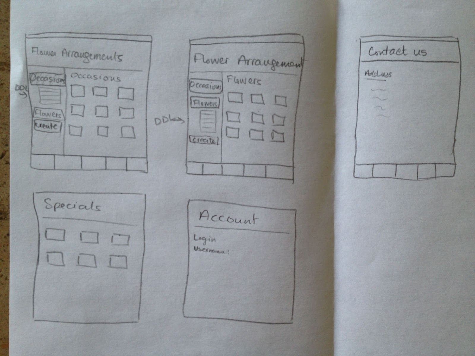
Clicking on Flower Arrangements in the menu will lead you to this page where a customer gets to choose a flower Arrangement according to Occasions (drop-down list), or a one flower bouquet or create their own bouquet.

This is the customer account's page where each customer can access their invoices, purchase history...

Dalia's Florist full logo

simple logo without title

logo with title

Actual iPhone app I created in App Development class.
The background color is different, I removed the pink part and kept the background with the logo shape. Menu buttons are smaller because it's actually an iPhone app. I used different fonts because the fonts I originally chose would not show on the iPhone or iPad unless I add the font file.


Monday 15 April 2013

iPad App Interface Design - Notes

The following are my notes for the florist App design, including some of the App's page interface design, icons, fonts, links...


Sunday 14 April 2013

iPad App Interface Design - app research

I decided to design a Florist iPad App because soon after I finish college, I'll be working on a Florist website for my cousin. So that way, I have all I need when I start working on the website, and hopefully one day I will create this App that I'm designing now.

I searched Florists Apps on my iPad App store and I came up with a few. I only took ideas for different pages that would be in a florist App. These are pictures of some of the ones I downloaded.


Sunday 7 April 2013

Interface Design - Final (Kiosk)

I used Illustrator to design this project, Kiosk interface. I used the colors for Metro North and RPA logos. 
I tried my best to make as little pages as possible to reach the end of buying a ticket for the people who are in a hurry (and that would be most). I know the feeling of a train approaching and still being on some level of buying the ticket and wishing to reach the end to get the ticket before the train leaves and not wanting to wait a while for the next one. 


Interface Design - Mock

Metro North and RPA logo will always be on the top left of the screen inside a light sky blue header, which at first, I designed it to put page titles in, but then couldn't decide what titles to give each page (some pages don't even have titles), and so I left it empty.
I used the logos' colors for my color scheme. I tried having the background a different color but it didn't look nice, and so I went with the plain white with a blue border. Font used is Nyala only.


Interface Design - Navigational/Structure Chart and Outline sketch

I changed the navigational structure, originally this is what I had. But then I thought of changing it and making it easier for the user to be able to choose multiple tickets and having different type of tickets at the same time.


This is the outline sketch of how my final design looks like, or almost.